
# Custom Story Group Styling
This guide shows you how to customize the story group view's style. Storyly provides three different pre-defined story group styles; Small, Large and Custom. However, if you want to use different style other than these pre-defined ones or if pre-defined ones do not satisfy your expectations then you should follow this section.
WARNING
If you are using pre-defined sizes and want to apply only some customizations, follow UI Customizations section.
# Customizable Classes
The following classes are fully customizable.
TIP
Please note that the following classes are optional.
storyly__story-preview
storyly__story-group-cover
storyly__story-group-pin
storyly__story-group-title
storyly__story-group-seen
Storyly Web SDK allows you to create custom Story Groups in the initialization process. Please use the following defination to use your HTML to set custom Story Groups.
storylyWeb.init({
  ...
  customStoryGroupHTML: "HTML"
});
TIP
If you use storyly__story-preview class, Storyly will use the image screenshot of the first unseen Story. If the Story content is a video, Storyly will use the thumbnail of the video.
# Custom Story Group Structure
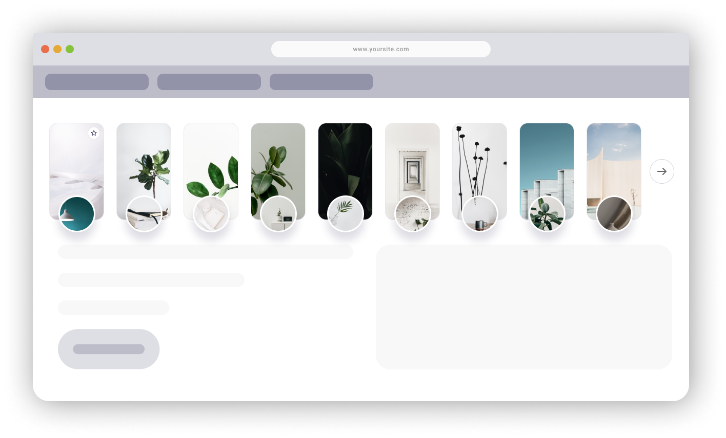
You can use the following template to create custom Story Groups. custom-story-group-container and custom-story-group class names are defined by us for example purposes only.
You may simply add the classes which we have described above in the following HTML template.
WARNING
The following HTML must be defined between div tags.
WARNING
You must use img tag for storyly__story-group-cover class.
WARNING
The following HTML must be String.
<div class="custom-story-group-container">
    <div class="custom-story-group">
        <div class="storyly__story-preview" fallbackURL="https://g2.img-dpreview.com/C7E98764B33A491FB5130BBDBB17E78C.jpg"></div>
          <img class="storyly__story-group-cover" />
          <span class="storyly__story-group-pin">
            <svg width="24" height="24" viewBox="0 0 24 24" fill="none" xmlns="http://www.w3.org/2000/svg">
               <rect x="0.25" y="0.25" width="23.5" height="23.5" rx="11.75" fill="white" stroke="#D3D3DC" stroke-width="0.5">
               <rect width="12" height="12" transform="translate(6 6)" fill="white"/>
               <path fill-rule="evenodd" clip-rule="evenodd" d="M12 7L13.545 10.13L17 10.635L14.5 13.07L15.09 16.51L12 14.885L8.91 16.51L9.5 13.07L7 10.635L10.455 10.13L12 7V7Z" stroke="#242450" stroke-linecap="round" stroke-linejoin="round"/>
            </svg>
           </span>
    </div>
</div>
TIP
If storyly__story-group-preview class cannot fetch the data, The fallbackURL will be used as preview image.
# Class Examples
The following classes are example purposes only. You may customize your own CSS by using the following classes.
    .custom-story-group-container {
      cursor: pointer;
      height: 230px;
      width: 107px;
      margin-right: 24px;
    }
    .custom-story-group-container .custom-story-group {
      position: relative;
      cursor: pointer;
      height: 190px;
      width: 107px;
      border-radius: 16px;
      border: 1px solid rgba(0, 0, 0, 0.2);
    }
    .custom-story-group .storyly__story-preview {
      position: absolute;
      left: 0;
      right: 0;
      top: 0;
      bottom: 0;
      background-size: cover;
      background-position: center;
      background-repeat: no-repeat;
      border-radius: 16px;
    }
    .custom-story-group .storyly__story-group-cover {
      height: 72px;
      width: 72px;
      border-radius: 50%;
      position: absolute;
      bottom: -36px;
      left: 18px;
      border: 3px solid #ffffff;
      box-sizing: border-box;
      filter: drop-shadow(0px 16px 20px rgba(36, 36, 80, 0.16));
    }
    .custom-story-group .storyly__story-group-pin {
      z-index: 1;
      position: absolute;
      right: 8px;
      top: 8px;
    }